Riso Basics @ Outlet
I took a class on risograph basics at Outlet in Portland and it was such a great class.
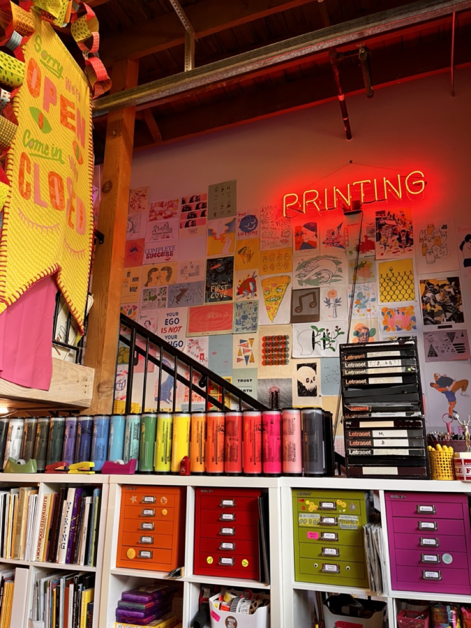
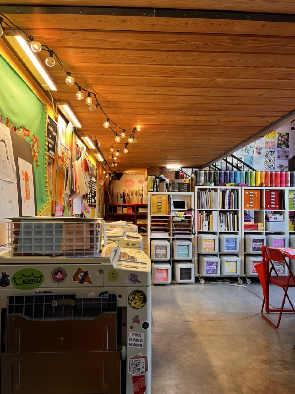
First off: just the space is gorgeous, like you stepped inside of a rainbow. The space is covered in prints, ink, stickers, and any collage making tool you could dream of.
The owners of Outlet, Kate Bingaman-Burt and Leland Vaughan, taught this class. They both teach at PSU in the graphic design department. Kate was filled with such an infectious energy and led the class with the energy of a pre-school teacher (complimentary).
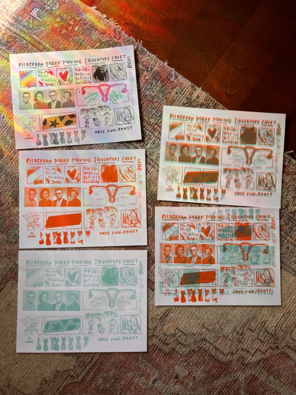
First we learned about the history of Riso, then a bit about how the machines work, and then we had 15 minutes to fill out a mark making sheet to start testing how the printers behave!
We had access to old yearbooks, books of clip art, mark making tools of all kind. Truly? A collager’s paradise. We then got to make a print a few different ways:
- In orange and with the boldest setting
- In mint and in the pencil setting (picks up on lighter marks)
- Double printed
- Double printed, but upside down (you know, for fun!)
I had the honor of being the example print since I was the first done—they even gave me a button as an award.
From there, we had about an hour to work on our final 2 print piece! The plan was to do a 25 print run, each printed in mint and orange.
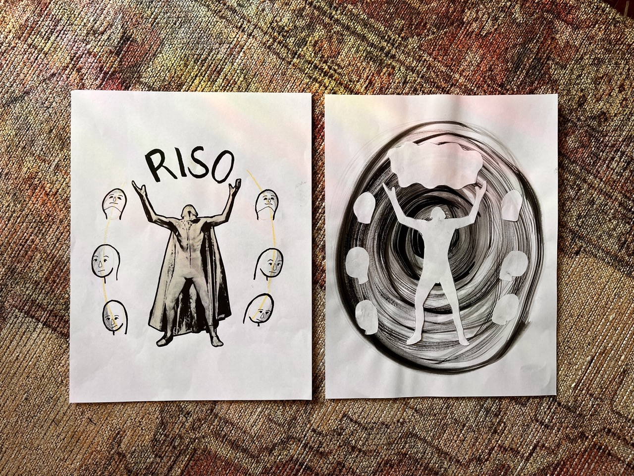
These were my masters! I found this truly bizarre photo in a yearbook from the 1960s for what must have been a play? Unclear. I used india ink on the swirl texture to see what kind of watercolor-esque effects I could get out of the printer. And then at the last minute I decided I wanted a bit more control of the contrast and used the lightbox to trace the foreground layer, cut out the masking layers, and then glue them over my textured background in the (hopefully) right (enough) spots.
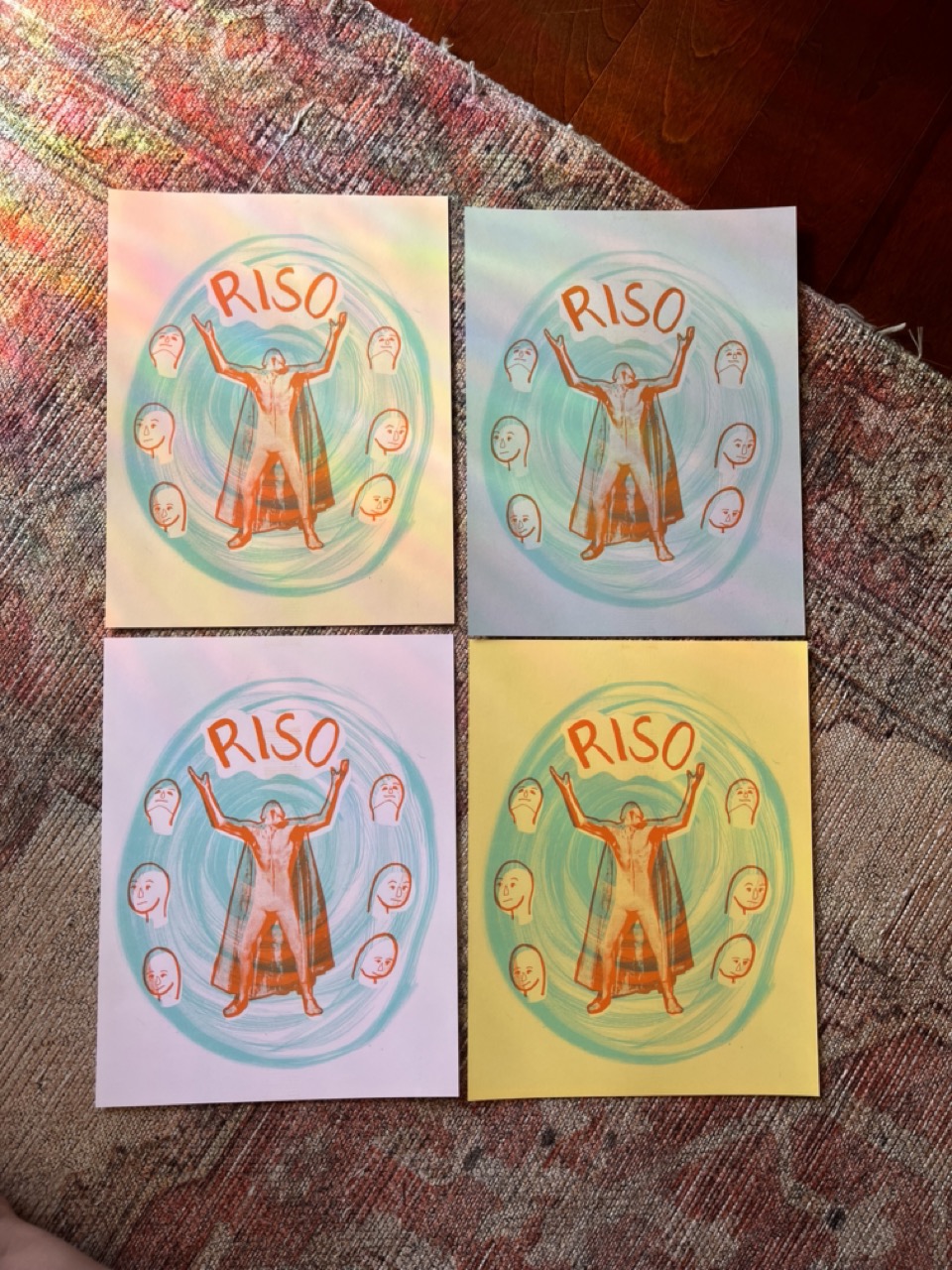
And here’s what it ended up looking like when printed! I was so glad I decided to just mask the man’s body and let the overlap of inks play with his cape.
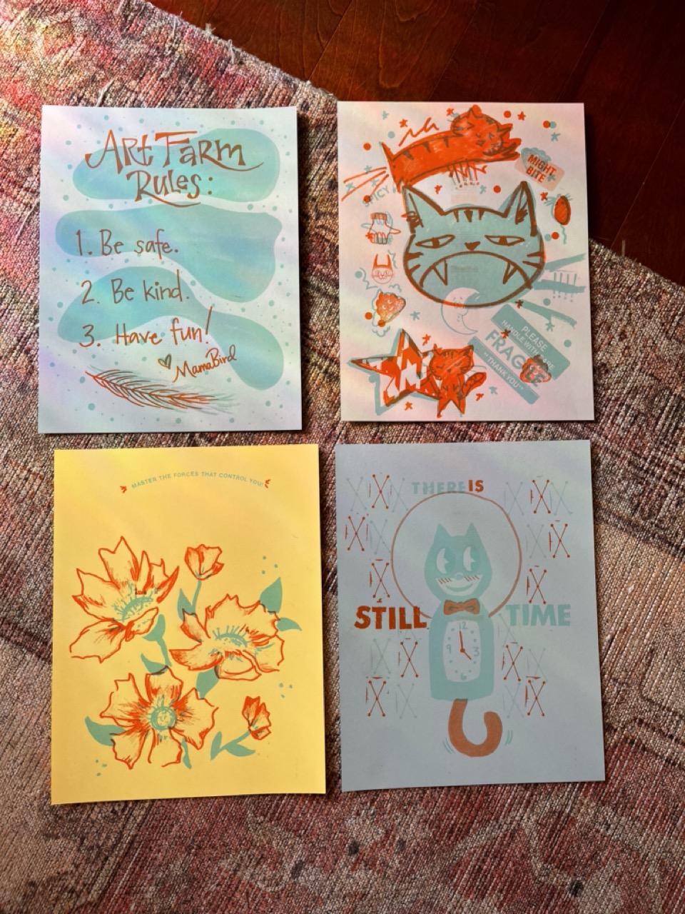
Once we all had our 25 prints, we traded amongst the students and went home with 10 prints from each of our classmates! Here are a few of my favorites:
I think this was one of my favorite classes of the year so far!
- Great instructors
- Quick turn around to seeing your art
- Gorgeous space
- Easily sharable pieces!